
Color Palette Inspiration from Real Weddings
For those who need a little help narrowing down a unique color palette for their Philadelphia wedding
One of the most exciting parts of wedding planning is choosing your color palette. It sets the tone for the entire day. From the bouquets in your hands to the way your reception space feels when the lights go down. We’ve photographed weddings all over Philadelphia and beyond, and the couples we work with constantly surprise us with fresh takes on color. From bold neon hues at Bok to the softest blues at Philander Chase Knox Estate, here are real-life palettes to inspire your own wedding planning.
.
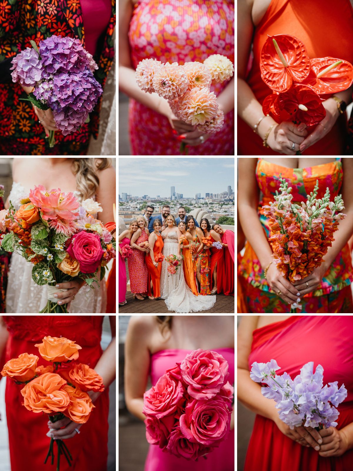
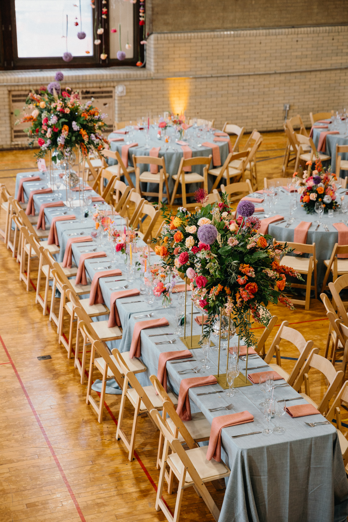
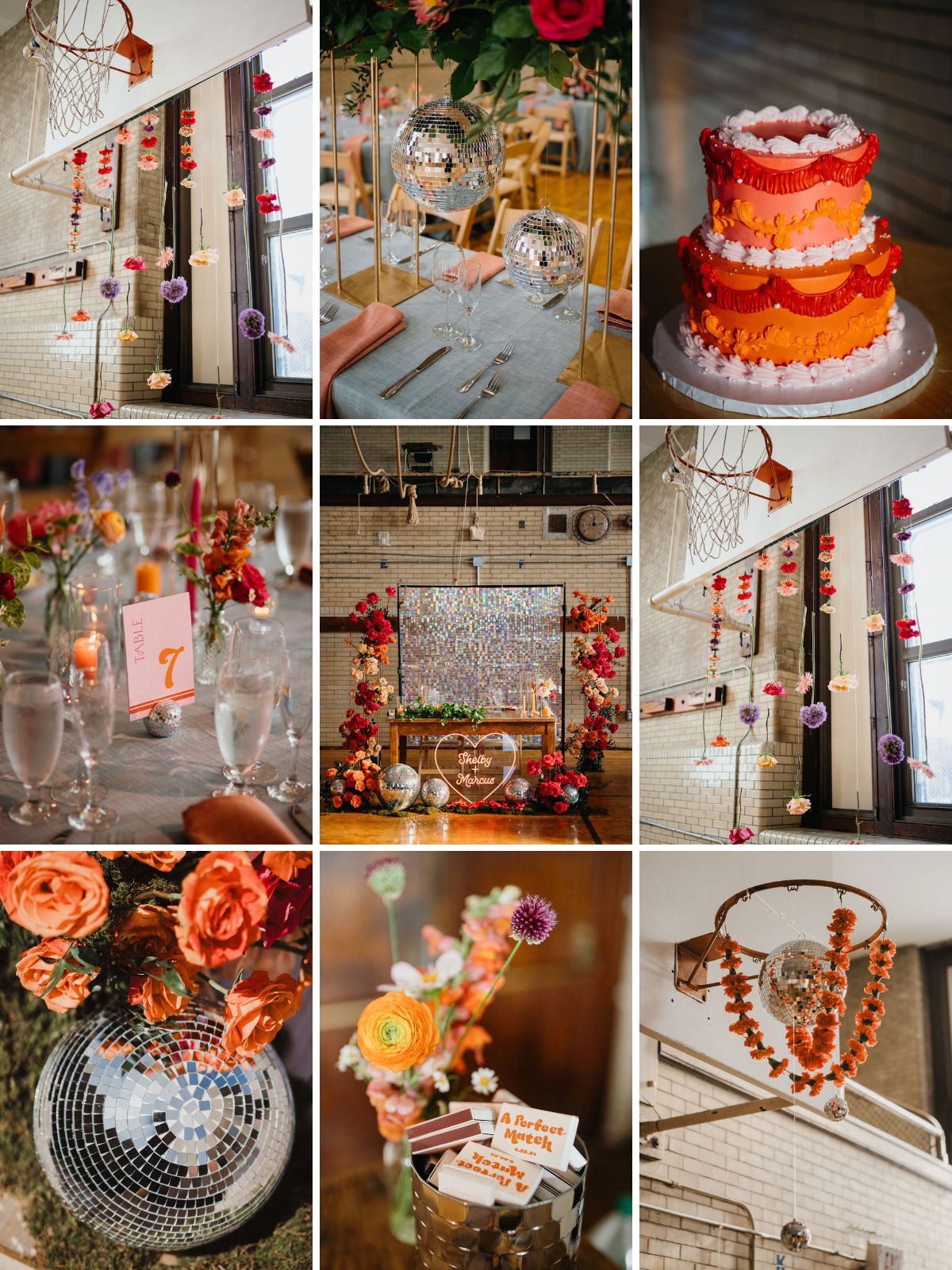
Shelby + Marcus’ Neon Sunset
Bok Wedding
Bok is already one of the most unique wedding venues in Philadelphia, and Shelby and Marcus made it even more electric with their neon sunset color palette. Think bright oranges, hot pinks, and punchy yellows that lit up the industrial space in the best way. They even designed hand-printed canvas bags in neon pink for their bridal party. It was such a fun and personal touch that tied their colors together. If you’re planning a Bok wedding and want to lean into a funky spring vibe, these bold tones show how much personality color can bring to your day.
.
.
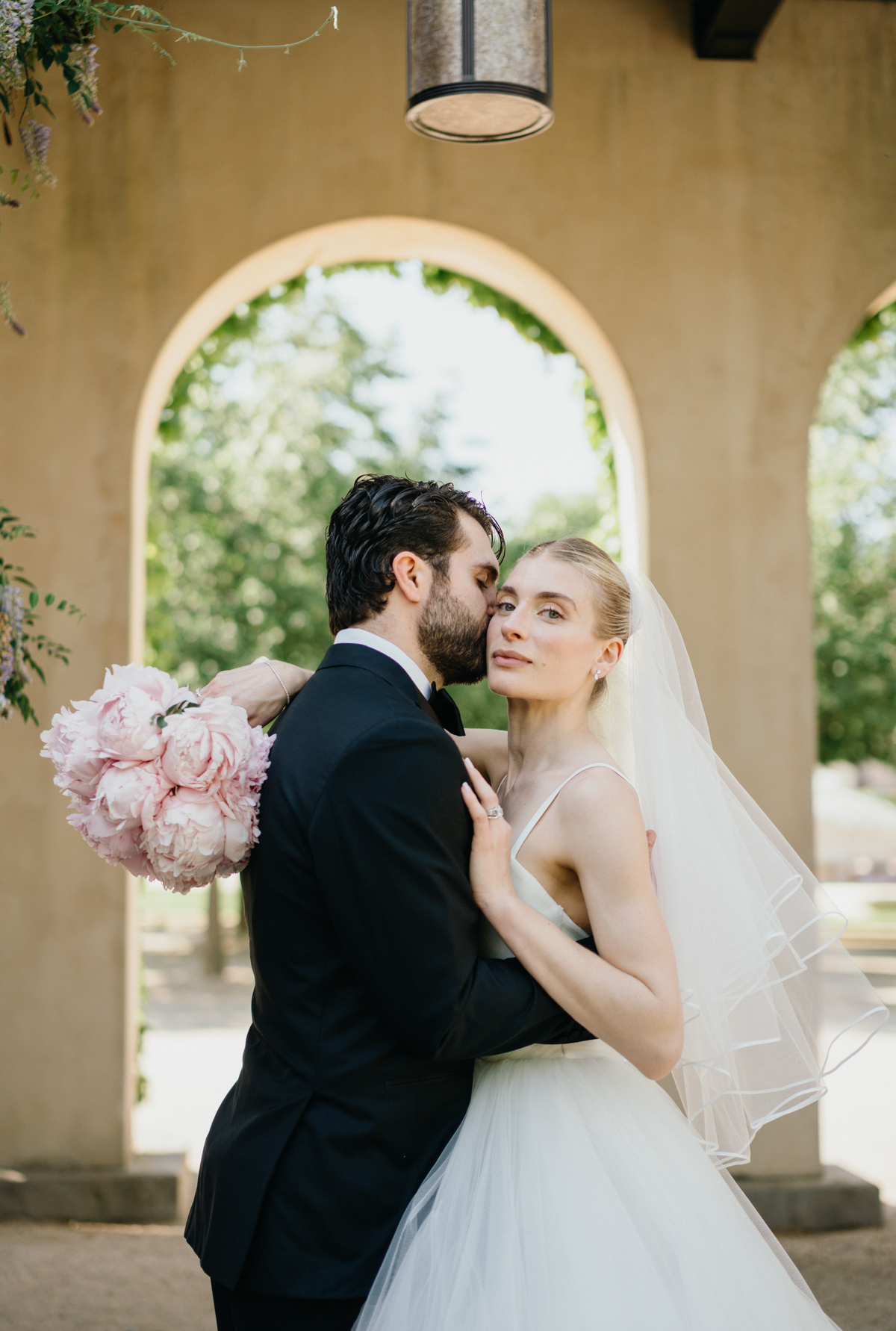
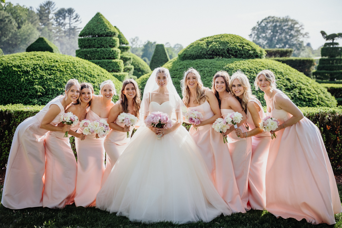
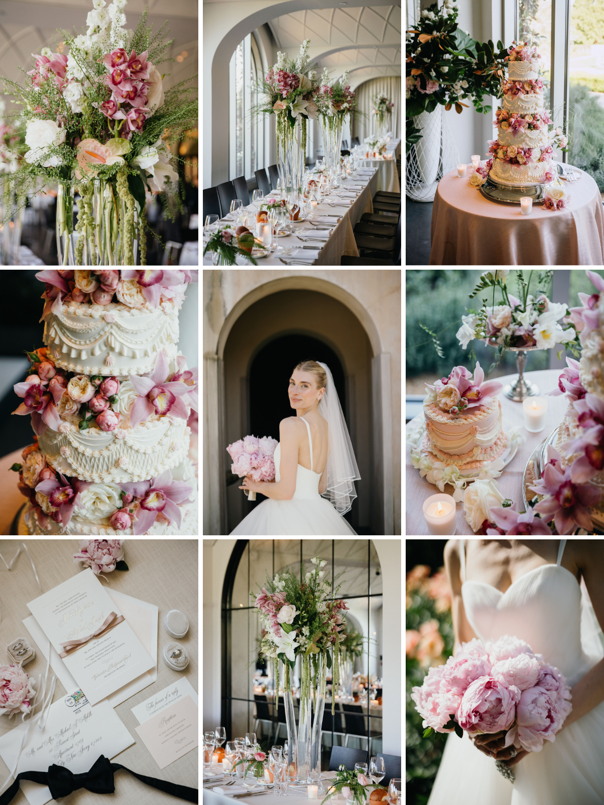
MJ + Kate’s Pink and White
Longwood Gardens Wedding
MJ and Kate’s Longwood Gardens wedding was pure European romance. Their pink and white palette complemented the editorial architecture and lush greenery of the venue, keeping everything soft but striking. They added incredible pink botanical florals throughout their reception space and even tucked blooms between the tiers of their vintage-style wedding cake. Longwood already feels like an escape to another world, and this color scheme enhanced that sense of timeless elegance.
Check out the rest of this Longwood Gardens wedding here!
.
.
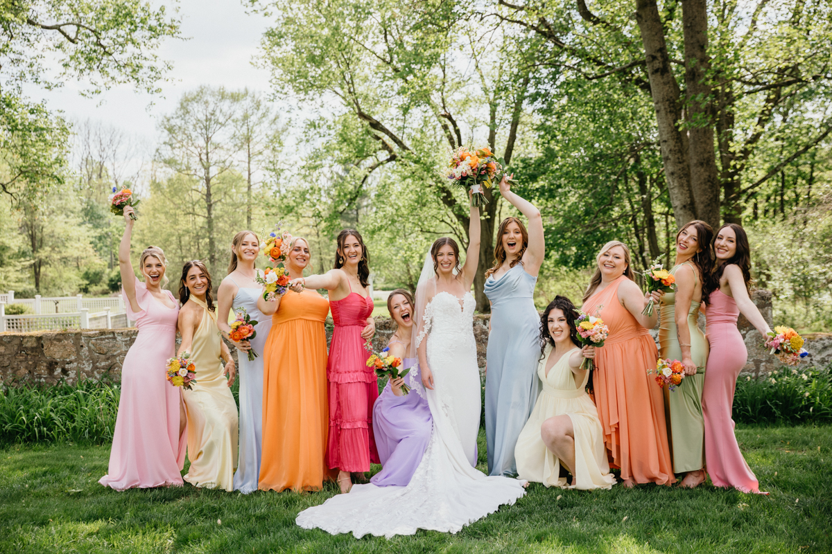
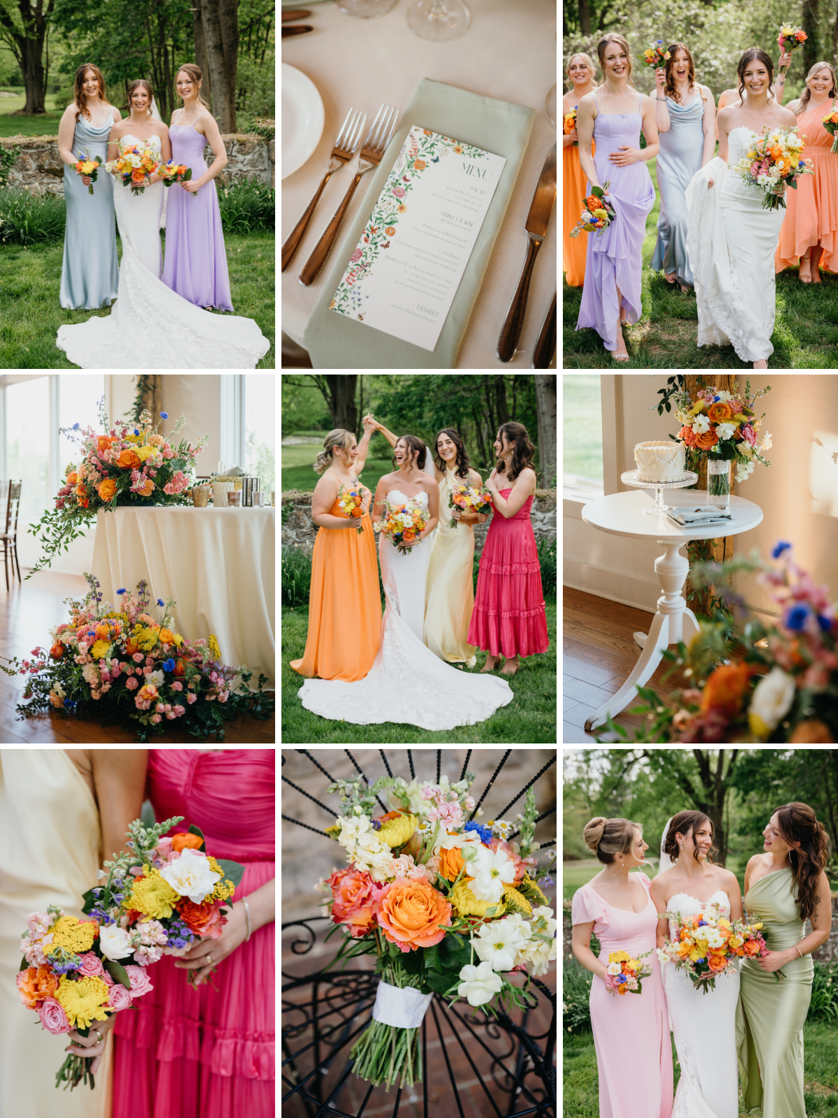
Nathan + Hannah’s Rainbow Pastels
Inn at Barley Sheaf Wedding
Nathan and Hannah’s Inn at Barley Sheaf Farm wedding was like stepping into a watercolor painting. Their rainbow-inspired palette featured soft, bright pastels with mismatched bridesmaid dresses and florals that spilled with every shade. This outdoor wedding felt playful and fresh, proof that a little color freedom can make your day feel joyful and relaxed.
See the rest of their Inn at Barley Sheaf Wedding here!
.
.
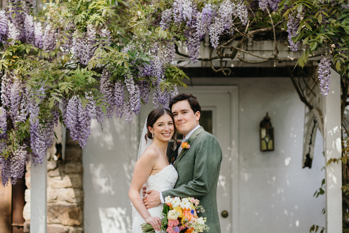
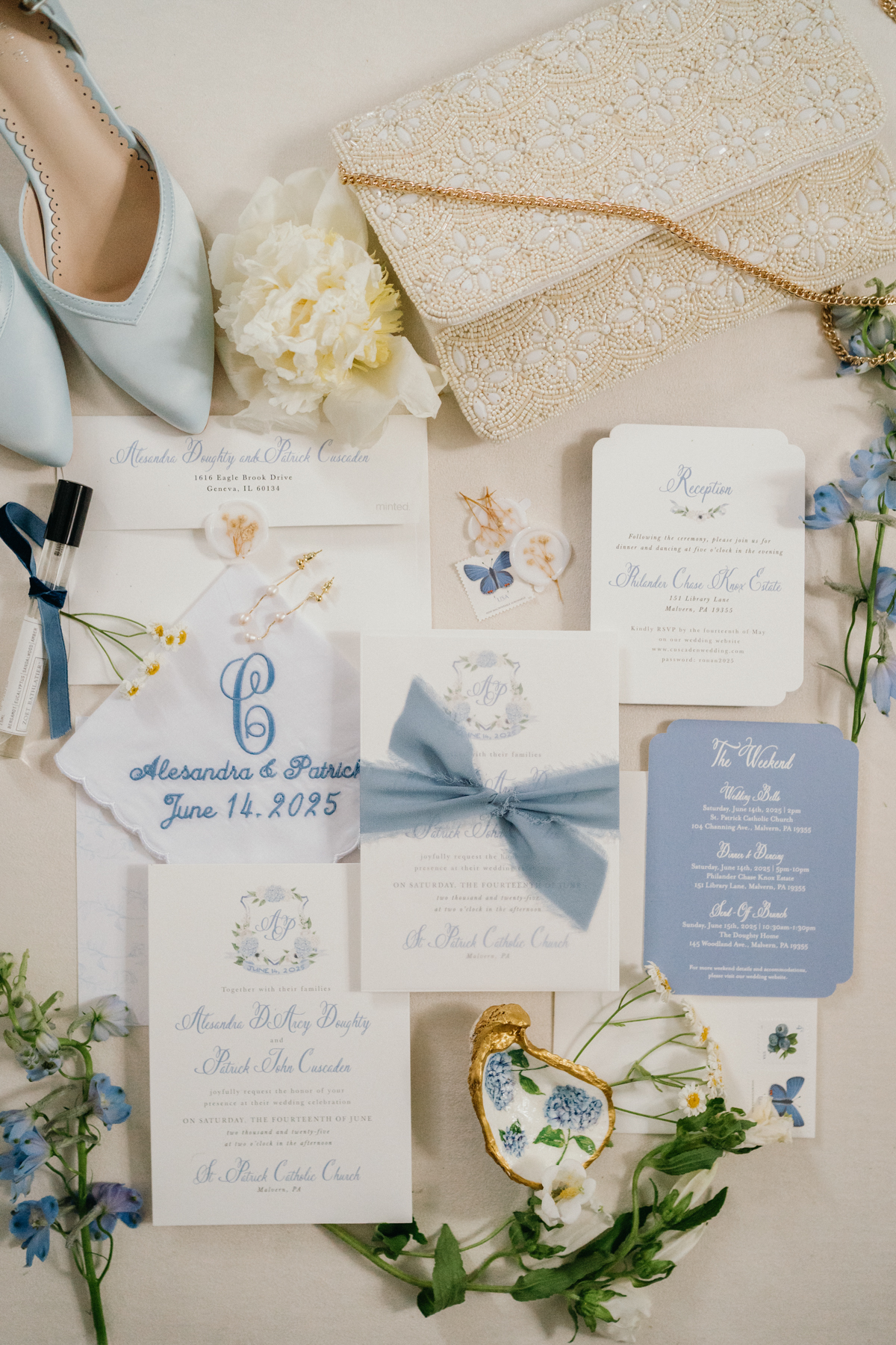
Pat + Ali’s Soft Blue and White Shades
Philander Chase Knox Estate Wedding
Pat and Ali’s Philander Chase Knox Estate wedding leaned into the softest palette of blue and white. Surrounded by the greenery of Valley Forge, the subtle tones kept everything feeling classic and airy. Ali carried the palette into a beautiful invitation suite, which set the tone for their estate wedding right from the start. It’s a timeless approach that works beautifully for historic venues, especially if you want your details to feel cohesive from the first impression.
.
.
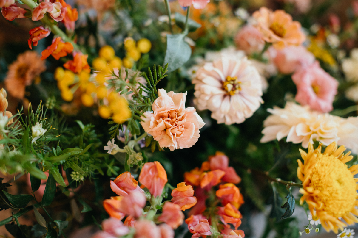
Eddie + Sylwia’s Warm Pastels
Terrain Gardens at DelVal Wedding
Terrain Gardens at DelVal has that perfect mix of rustic charm and modern design, and Eddie and Sylwia filled it with soft warm pastels. Peach, blush, and muted yellows paired perfectly with the garden setting. Their reception tables were lined with delicate bud vases, carrying the color scheme through every detail of the design. This palette is a reminder that subtle color can still feel vibrant when paired with natural textures like wood, stone, and greenery.
Take a look at the wedding video for this Terrain Gardens at DelVal here!
.
.
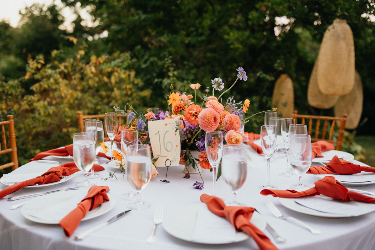
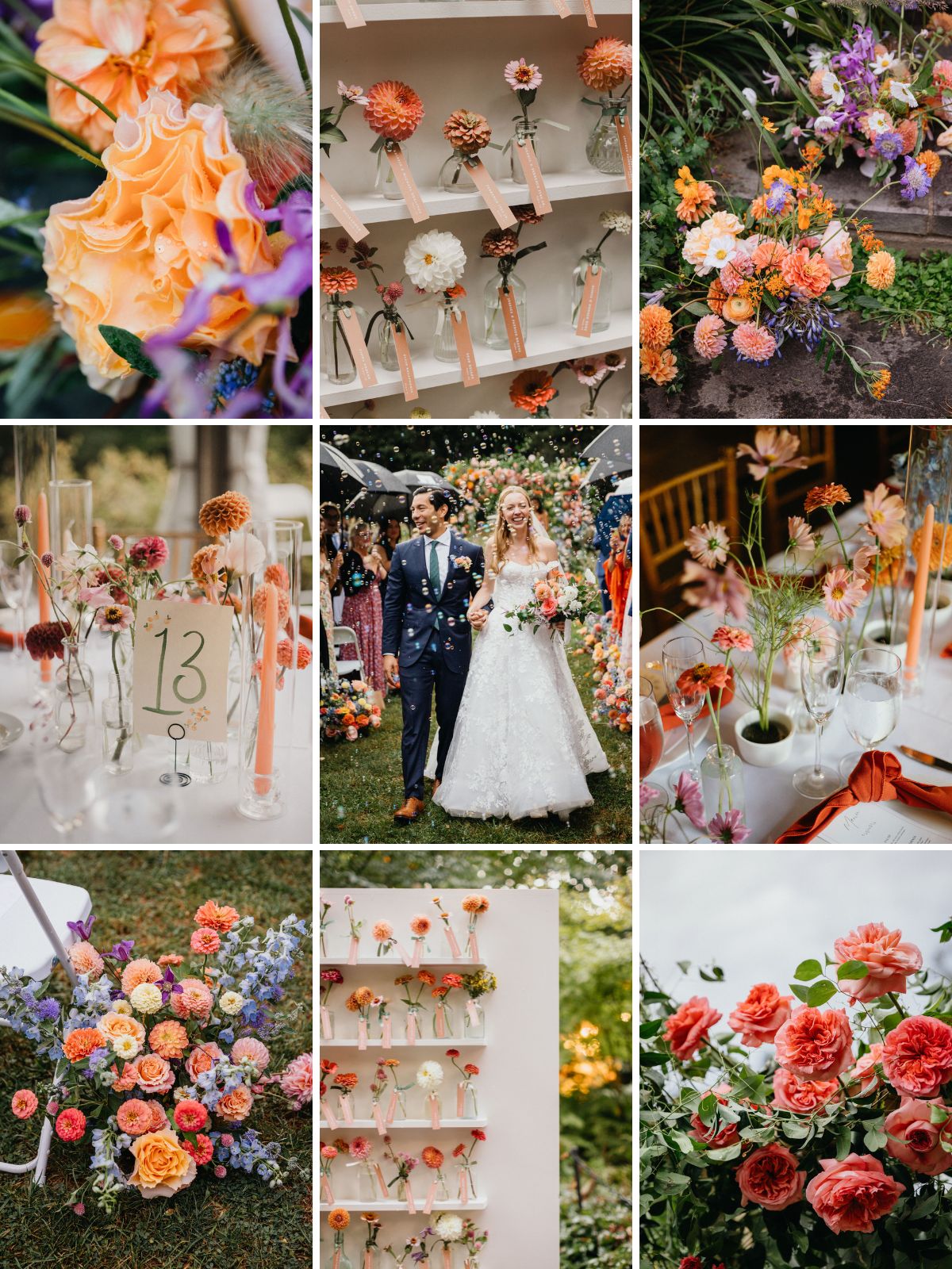
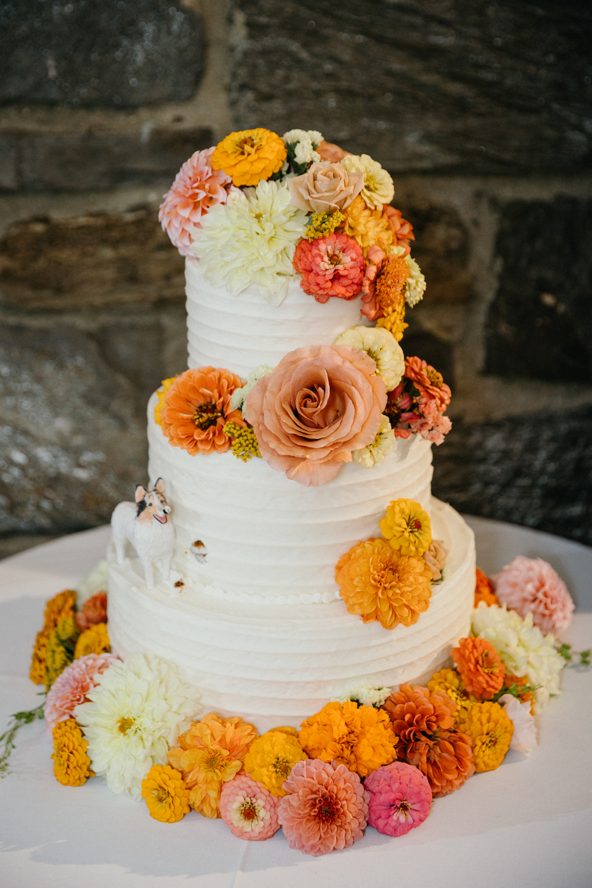
Julia + Brandon’s Sunset Tones
Morris Arboretum Wedding
Julia and Brandon’s Morris Arboretum wedding embraced the warm glow of sunset. Their palette mixed pinks, corals, and oranges, which popped against the lush trees and classic stone structures of the arboretum. To tie it all together, they created a bud vase seating chart, letting their color story shine from the moment guests arrived at the reception. For couples drawn to romantic outdoor weddings, these hues bring a perfect balance of warmth and vibrancy.
See the rest of Julia + Brandon’s Morris Arboretum wedding here!
.
.
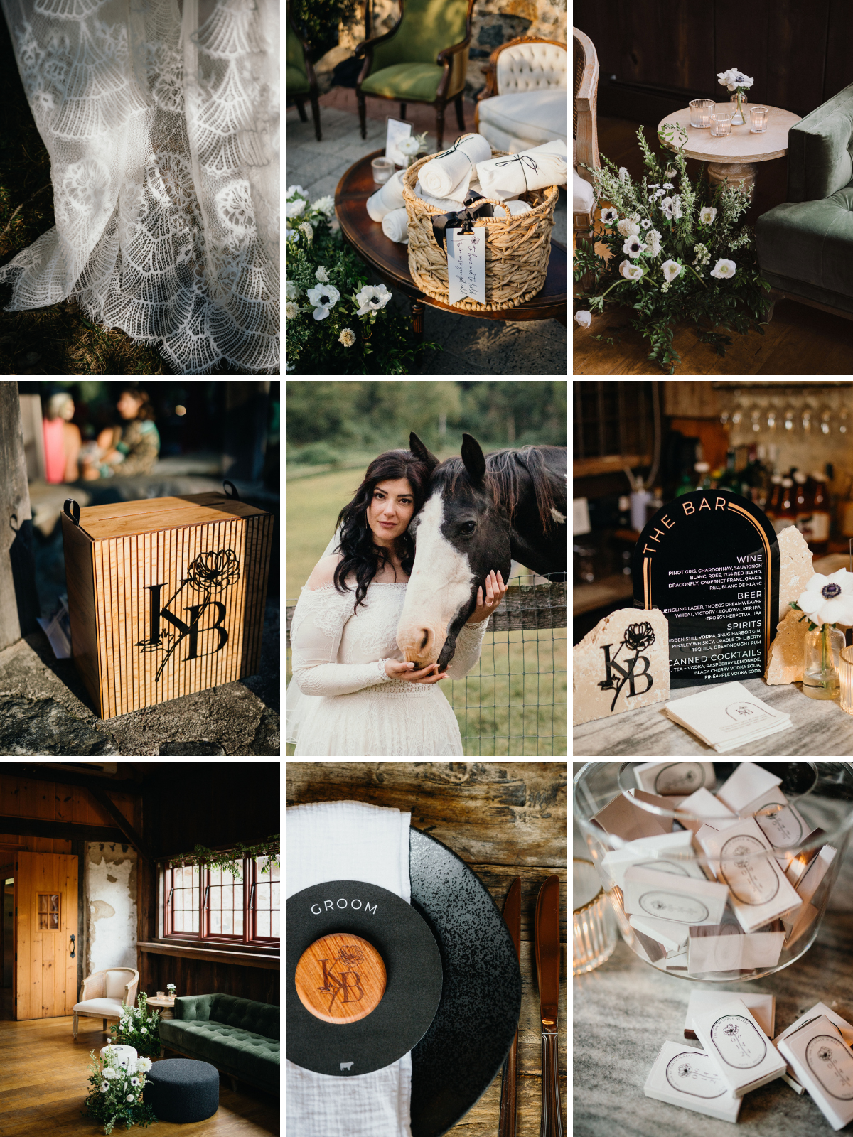
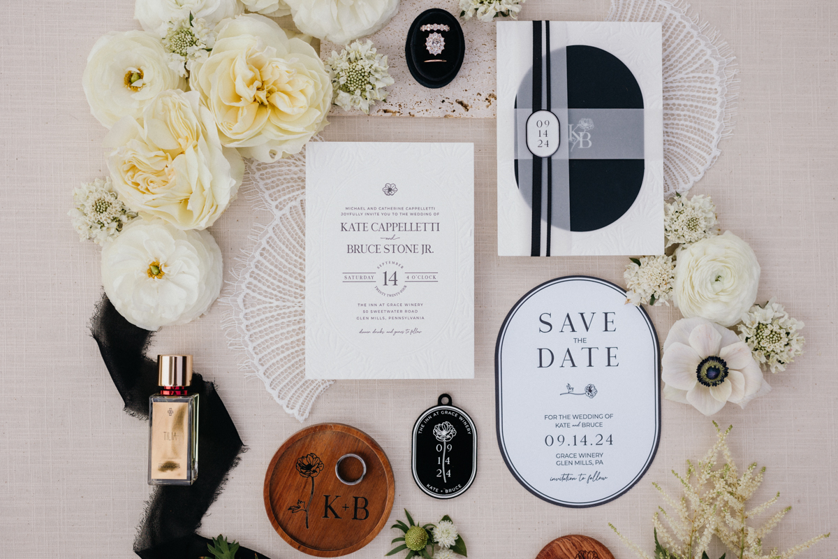
Kate + BJ’s Black and White Palette
Grace Winery Wedding
Kate and BJ proved that black and white can feel fresh for spring. Their Grace Winery wedding blended timeless neutrals with just enough seasonal touches—florals and textures that softened the formality. They leaned into the vintage elegance of their palette with subtle design nods that made the winery feel both classic and personal. It’s a perfect example of how a minimal color story can still feel warm and inviting when paired with thoughtful details.
Look at the rest of Kate + BJ’s unique wedding reception at Grace Winery here!
.
.
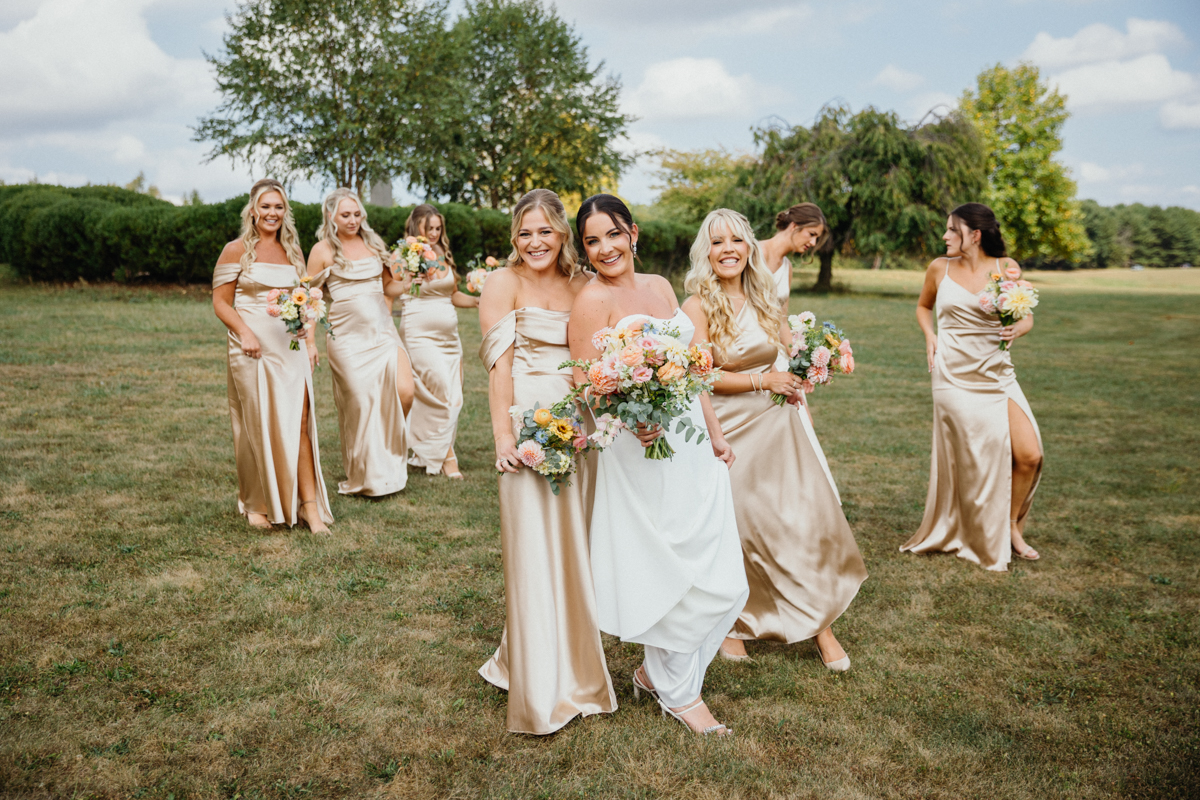
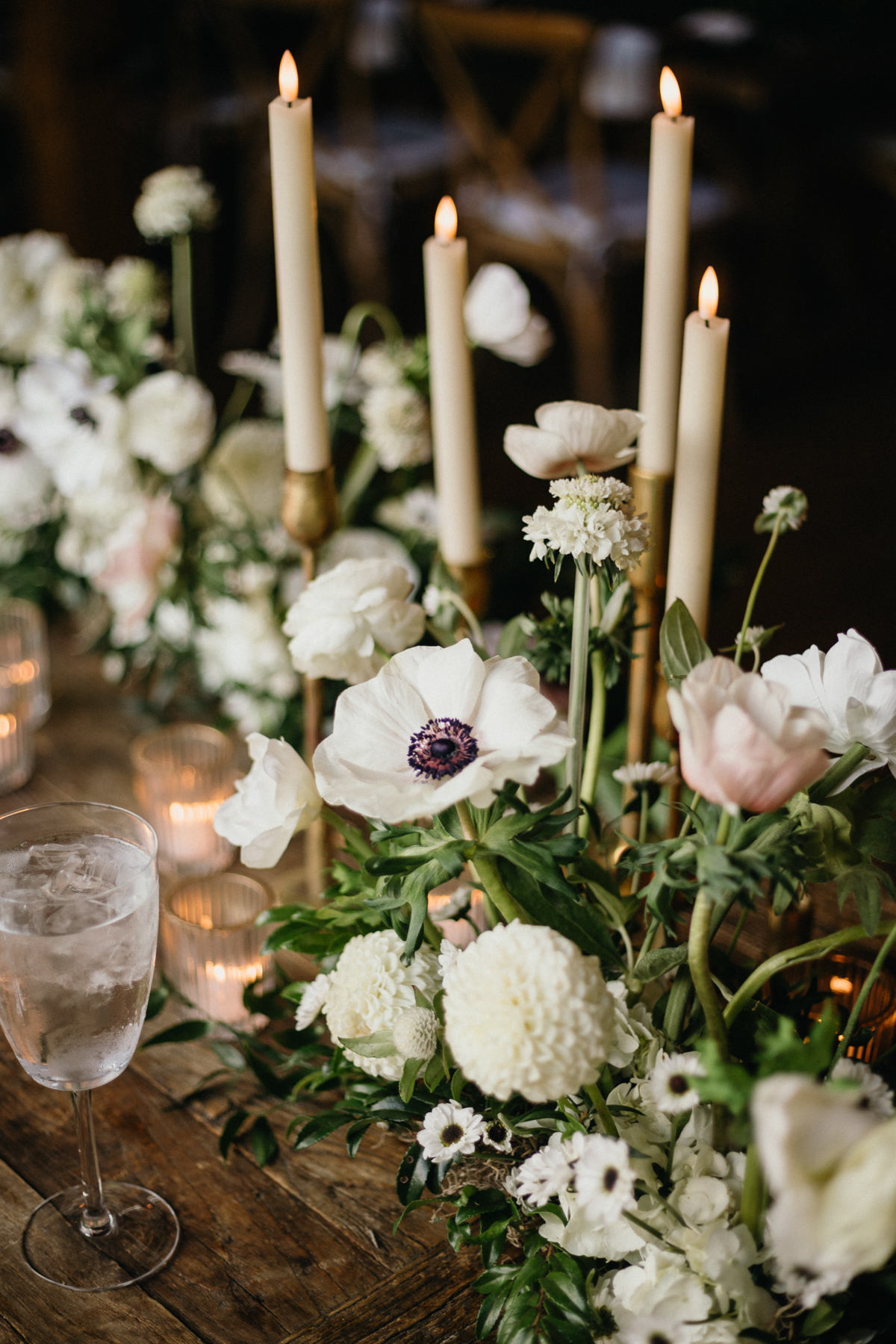
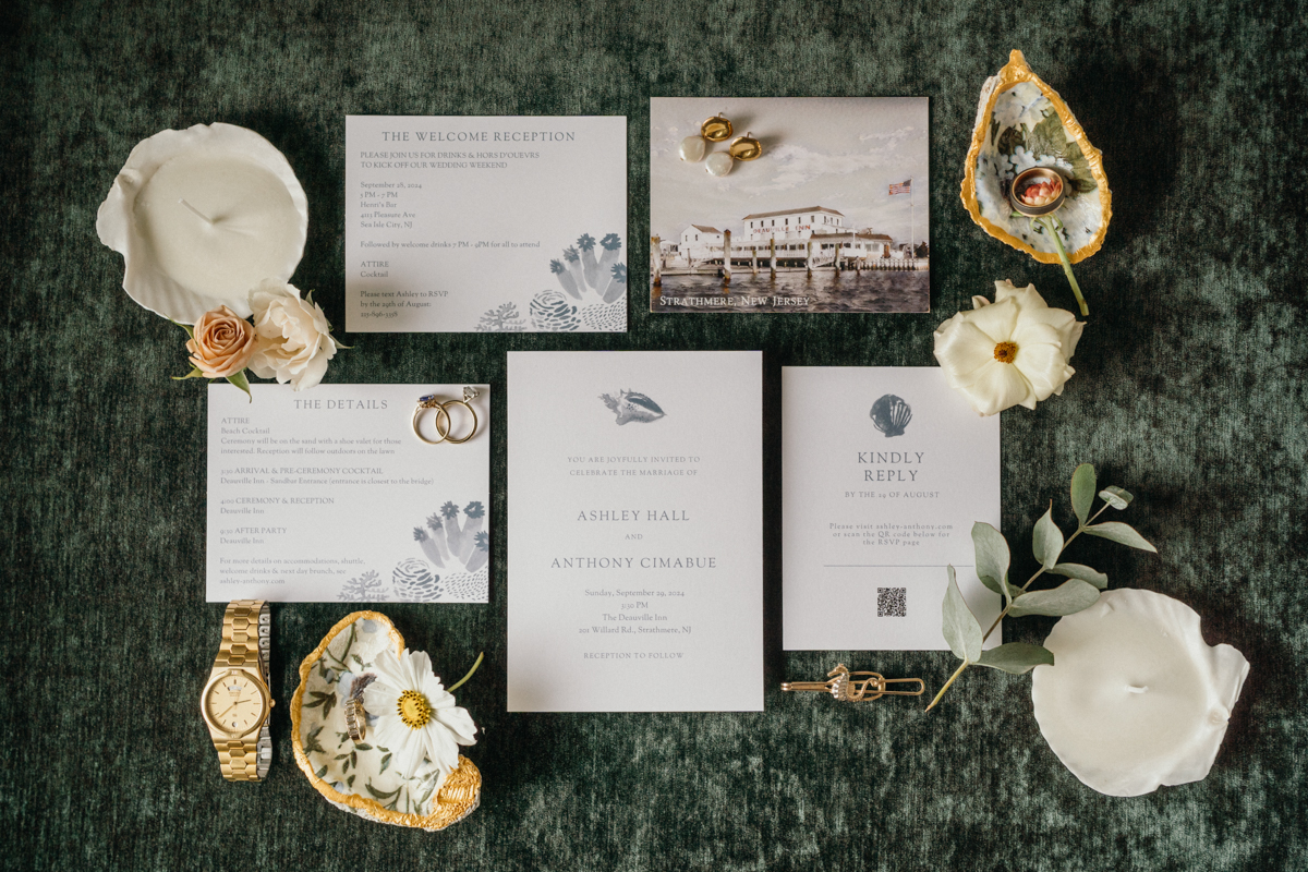
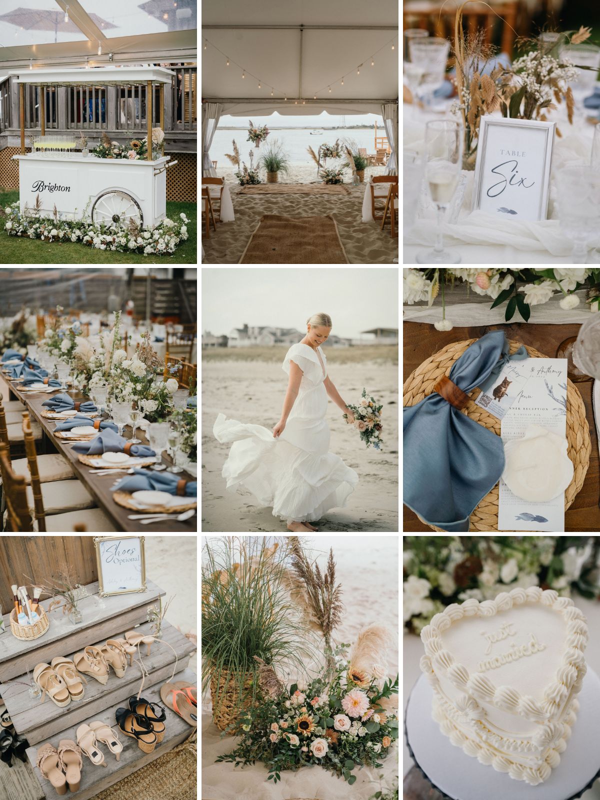
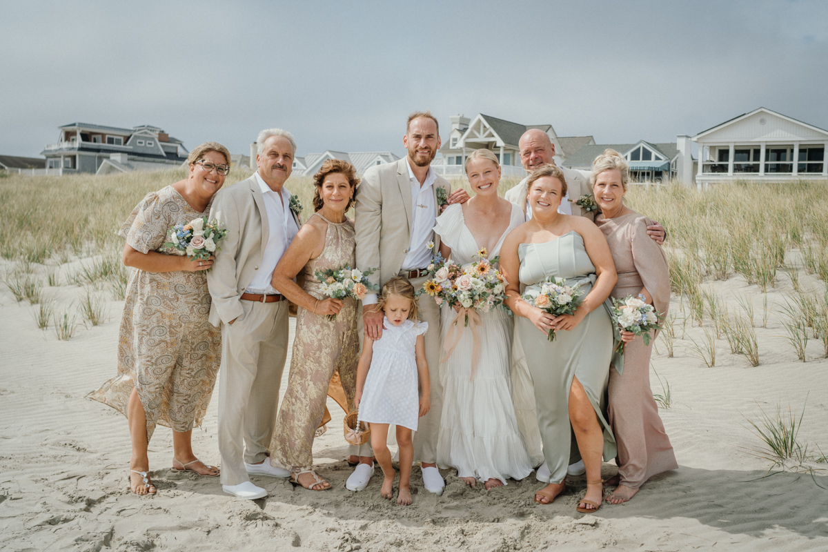
Ashley + Anthony’s Boho Neutrals
Deauville Inn Wedding
Okay, this one is outside the area, but they are a Philly couple, so same thing. For their Deauville Inn wedding on the beach, Ashley and Anthony kept things natural with a palette of boho neutrals. Sandy tones, soft taupes, and touches of white reflected the shoreline without competing with it. Pampas leaves and rattan rugs pulled their colors together beautifully, giving the entire setup an organic, stylish vibe. If you’re dreaming of a coastal wedding, this kind of palette lets the ocean and sky do the heavy lifting while still creating a chic, designed atmosphere.
You can check out the rest of their Deauville Inn Wedding here!
.
.
Closing Thoughts on Philadelphia Wedding Color Palettes
Color is such a personal choice, and there’s no one “right” way to do it. Whether you’re pulled toward bold, vibrant shades or a soft, neutral look, your palette should reflect your energy as a couple.
..


